Boxplot in R
Boxplot
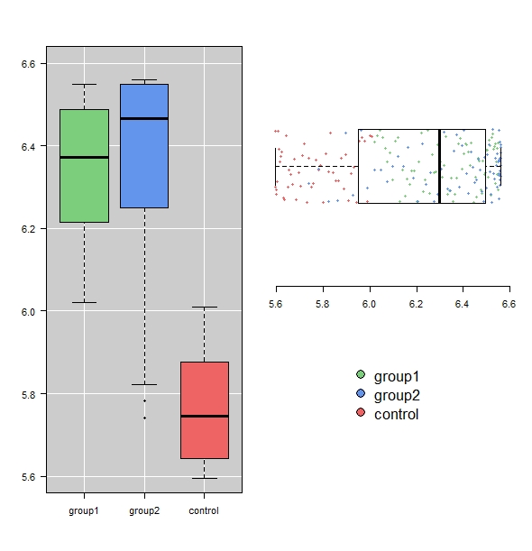
With a boxplot you can show the distribution of your data easily. Differences between two or more groups may already be indicated by boxplots.
However, boxplots are not always equal. There is no unambiguous convention about what a boxplot represents. This may vary by the software. Boxplots which have been drawn using the boxplot()-function, show the following parameter:

Notice: the length of a whisker can take at a max 1.5 times the interquartile range. If the dataset contains values bigger or smaller, they will be shown as outliers.
Some more helpful hints can be found in this video (in German): Boxplot R
This graphic was created using the following code:
fn <- 705.87 + 1.201*x + -3.0554*x^2 + -0.10117*x^3

y <- log(fn)
g <- factor(c(rep("control", 50), rep("group1", 75), rep("group2", 75)), levels = c("group1", "group2", "control"))


layout(matrix(c(1, 1, 1, 2, 2, 3), ncol = 2))
plot(1, 1, type = "n", xlim = c(0.5, 3.5), ylim = c(5.6, 6.6), axes = FALSE, xlab = "", ylab = "")
rect(par("usr")[1], par("usr")[3], par("usr")[2], par("usr")[4], col = "grey80")
for(i in 1:3) abline(v = i, col = "white")
for(i in seq(5.6, 6.6, 0.2)) abline(h = i, col = "white")
boxplot(y ~ g, las = 1, ylim = c(5.6, 6.6), col = c("palegreen3", "cornflowerblue", "indianred2"), pch = 19, add = TRUE)

op <- par(bty = "n", mar = c(7, 0, 4, 1) + 0.1)
plot(1, 1, type = "n", ylim = c(0.4, 1.6), xlim = c(5.6, 6.6), axes = FALSE, xlab = "", ylab = "")
points( y, jitter( rep( 1, length(y)), 10), pch = 19, cex = 0.6, col = c("palegreen3", "cornflowerblue", "indianred2")[g])
boxplot(y, horizontal = T, ylim = c(5.6, 6.6), xlim = c(0.4, 1.6), add = TRUE)


plot(1, 1, type = "n", ylim = c(0.4, 1.6), xlim = c(5.6, 6.6), axes = FALSE, xlab = "", ylab = "")
legend(5.9, 3, legend = levels(g), pch = 21, pt.bg = c("palegreen3", "cornflowerblue", "indianred2"), pt.cex = 2, cex = 1.65, bty = "n", xpd = TRUE)
par(op)
Tags
Boxplot, different colours, background colours, horizontal, x-axis, y-axis, bottom, left, top, right, lables, without ggplot, legend, several plots next to each other, multile plots in one graph, add points, bachelor thesis, master thesis